Responsive Styled Google Maps Gpl Download
2,97 $
- Very cheap price & Original product !
- We Purchase And Download From Original Authors
- You’ll Receive Untouched And Unmodified Files
- 100% Clean Files & Free From Virus
- Unlimited Domain Usage
- Free New Version
- Product Version: 5.0
- Product Last Updated: 30.06.2020
- License: GPL
Responsive Styled Google Maps
An Overview of Responsive Styled Google Maps Plugin
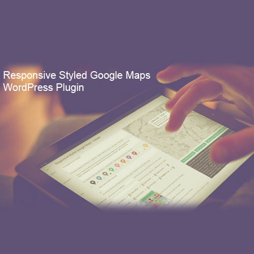
Responsive Styled Google Maps is a WordPress plugin that enables you to easily embed customized and responsive Google Maps on your website. It allows you to add markers, customize map styles, and create interactive maps that adapt seamlessly to different screen sizes.
Key Features of Responsive Styled Google Maps Plugin
Customized Map Styles: The plugin provides options to customize the appearance of your Google Maps. You can choose from various map styles, including different color schemes, map types (roadmap, satellite, terrain, or hybrid), and elements to display (such as markers, labels, or controls).
Marker Management: You can add markers to your maps to indicate specific locations or points of interest. The plugin offers options to customize marker icons, colors, and labels, allowing you to create a visually appealing and informative map.
Responsive Design: Responsive Styled Google Maps ensures that your maps are responsive and adapt to different screen sizes and devices. This means that your maps will display correctly and provide optimal user experience on desktops, tablets, and mobile devices.
Map Controls: You have control over the map controls displayed on your Google Maps. You can choose to show or hide controls such as zoom, pan, fullscreen, and street view, depending on your preference and the functionality you want to provide to users.
Infowindows and Pop-ups: The plugin allows you to display additional information or content in infowindows or pop-ups when users interact with markers on the map. This feature is useful for providing details about specific locations, such as addresses, descriptions, images, or links.
Map Embedding Options: Responsive Styled Google Maps provides flexible embedding options. You can embed maps using shortcodes, widgets, or directly in your theme files, giving you the freedom to integrate maps seamlessly into your website’s layout.
Geolocation Support: The plugin supports geolocation, allowing users to view their current location on the map. This feature can be useful for providing directions or displaying nearby points of interest.
Multiple Maps on a Page: You can create and display multiple maps on a single page or across different pages of your website. This is beneficial if you have multiple locations or want to showcase various areas of interest.
Custom Map Markers: In addition to the default markers provided by Google Maps, Responsive Styled Google Maps allows you to use custom marker icons or images. This enables you to personalize the appearance of your markers and align them with your brand or website design.
Map Interaction: Users can interact with the maps by zooming in and out, panning, and clicking on markers for more information. This interactivity enhances the user experience and allows for easy exploration of map content.
Benefits of Using Responsive Styled Google Maps Plugin
Customization: The plugin gives you full control over the appearance and styling of your Google Maps, allowing you to create maps that match your website’s design and branding.
Responsiveness: With responsive design, your maps will adapt to different screen sizes, ensuring optimal display and usability on various devices.
Enhanced User Experience: Interactive maps with customized markers and infowindows provide an engaging and informative experience for users, allowing them to easily explore and interact with the map content.
Geolocation and Directions: The geolocation support and the ability to display directions on the map help users find their way or locate nearby places of interest.
Easy Embedding: The plugin offers multiple embedding options, making it easy to integrate maps into your website using shortcodes, widgets, or theme files.
Multiple Maps Support: Whether you have multiple locations or want to showcase different areas, the plugin allows you





Reviews
There are no reviews yet.